Adult Orata Series (23) Postmark 15mm width 9m length 1 piece
Hurry! Only 0 Left in Stock!


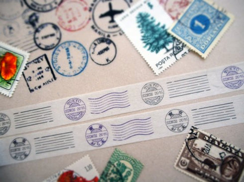
The 23rd work from the adult Orata series is a postmark.
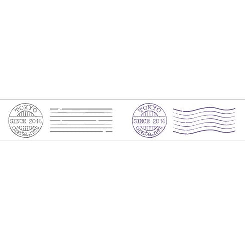
The stamp is designed to look like an overseas postmark, and two colors of gray and purple stamps are printed alternately.
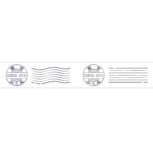
The alphabet is a retro typewriter typeface with a faded feel, and the Japanese typeface is a retro typeface that has the feel of being printed on a letterpress printing machine in the Meiji, Taisho, or early Showa eras.
Kanji are written in old kanji that are no longer in use.
When entering characters, please enter three types of characters: upper/middle/lower, separated by slashes (/).
Sample character input example↓
TOKYO/SINCE 2016/orata.net
Tokyo/SINCE 2016/Orata
The number of characters is both alphabetic and Japanese.
The top row can be up to 7 characters, the middle row can be up to 10 characters, and the bottom row can be up to 9 characters.
I think the shorter the text, the more impact it will have.
Each section is 4.5cm long, and it is not possible to create different characters alternately.
I think it would be nice to make a collage with used stamps, or use it as a wrapping seal, or add the shop name to make it a focal point of the package.
I made it so that it doesn't show too much individuality, so I think you can enjoy the originality of your name, store, message, etc. by changing the characters you put in.


